✅
Simple and intuitive onboarding to help the LLM understand each user’s interests and writing preferences.
✅
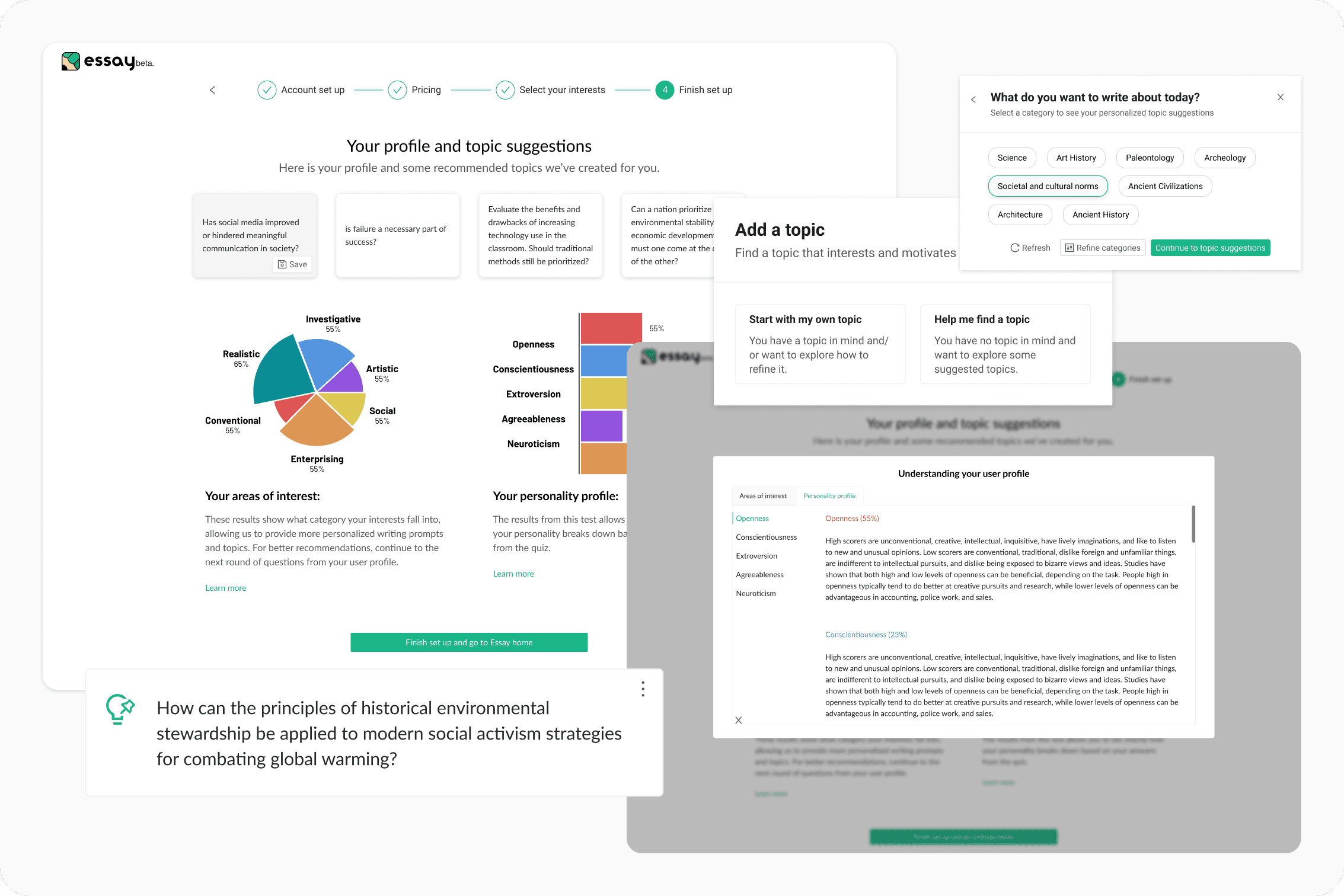
Clear, guided messaging to walk users through using the Topic Finder when starting a new essay.
✅
Personalized topic suggestions with opportunities to continuously refine the user’s LLM profile through feedback and optional profile questions.

USER TESTING
Unlike with most design projects, I kicked this one off with an existing prototype that was built by an external LLM developer commissioned by Essay’s CEO. Since the demo was a rough version of the feature we were hoping to build, I decided to do an informal user testing session with everyone on the Essay team. My hope was to garner some feedback and first impressions that I could use to guide my designs.
Guide users early and closely
We should be guiding users at the start of the quiz to help them understand the purpose of all the questions.
Utilize some variety
Use visual cues to break up the form’s monotony and clearly indicate when users progress to a new stage of the quiz
Simplicity at its best
We should focus on only the questions that are essential for the LLM’s baseline data. The fewer required, the better the user experience.
Transparency builds trust
Users need to understand the purpose of their answers and see tangible results to stay motivated and engaged.
The first step was outline how the topic tool might fit into our existing app. Did we want a separate feature or did we want to incorporate this into our existing tools?


Brainstorm of the various ways we could incorporate a topic generator into the Essay platform.
Based on the user flows I outlined, the team decided to incorporate the topic finder into our existing tools to make the addition of a new feature feel more seamless.
I then outlined what an ideal user flow would look like, from onboarding and then into the actual app itself and its interactions with various other tools.


Then came V1


The first iteration of the onboarding quiz.


The first iteration of the brainstorm modal. This is where the topic finder lives in the Essay workspace.
Improvements
Dropdown menu meant more clicks before users could get to the topic generating modal.


Streamlining the user flow simplified the options onto the modal itself and reduced # of clicks.


Onboarding quiz text was confusing and provided very little context for users.


Modals were used before each section to grab the attention of the user and provide more context.


Users were presented with both choices in the brainstorm modal with no context, this caused some confusion between the two different choices.


Using a progressive disclosure modal allowed users to see more context and directly see the impact of their decisions.


Although the second iteration helped to address some of the confusion surrounding the purpose of the onboarding quiz, I felt like it didn’t address one of the main concerns of users expressing the desire to drop off during the onboarding quiz.
After some brainstorming with the development team, we decided to do an overhaul of the onboarding quiz to simplify the copy, the user flows, and get users to the home screen in a more direct way.
✅
Simplified the copy of the interest selector
✅
Removed the RIASEC categories as they were adding to the confusion the copy of the interest selector
✅
Simplified the user flow for selecting interests and adding interests to mimic existing onboarding personalization flows from other similar apps


✅
Showing suggested topics right after users select an interest helped to bridge the disconnect between the purpose of the onboarding questionnaire and the topic generation
✅
Breaking the monotony of the quiz via a more visually engaging UI


✅
Minimizing the visual clutter by removing any sort of tab selection option
✅
Streamlining the flow to make it easier for users to provide the LLM with more guidance and provide feedback on generated topics

More projects

✅ Simplified the copy of the interest selector