Design system
Design system
Design system
Building and scaling Essay's design system
Building and scaling Essay's design system
Building and scaling Essay's design system
Building and scaling Essay's design system
Building and scaling Essay's design system
Building and scaling Essay's design system
I aimed to create a scalable and accessible design system that would create a consistent experience across desktop and mobile platforms, streamline developer handoff, and improve design efficiency.
I aimed to create a scalable and accessible design system that would create a consistent experience across desktop and mobile platforms, streamline developer handoff, and improve design efficiency.
I aimed to create a scalable and accessible design system that would create a consistent experience across desktop and mobile platforms, streamline developer handoff, and improve design efficiency.
I aimed to create a scalable and accessible design system that would create a consistent experience across desktop and mobile platforms, streamline developer handoff, and improve design efficiency.
I aimed to create a scalable and accessible design system that would create a consistent experience across desktop and mobile platforms, streamline developer handoff, and improve design efficiency.
I aimed to create a scalable and accessible design system that would create a consistent experience across desktop and mobile platforms, streamline developer handoff, and improve design efficiency.


Nov 2025 to Jan 2026
Timeline
Product Designer
Role
Currently in use
Output
Nov 2025 to Jan 2026
Timeline
Product Designer
Role
Currently in use
Output
THE PROBLEM
THE PROBLEM
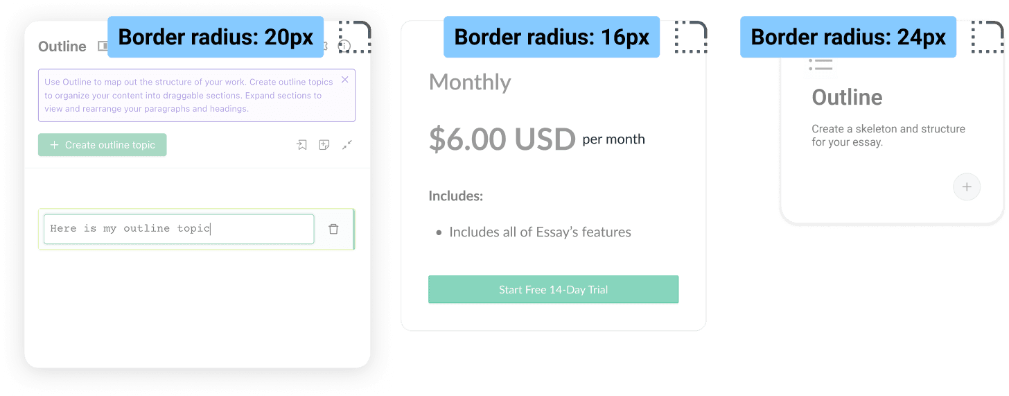
Essay’s current design system was inconsistent. Just from a quick audit across the desktop application, I could see that there were many inconsistencies ranging from component padding, use of color, and even hover states.
Essay’s current design system was inconsistent. Just from a quick audit across the desktop application, I could see that there were many inconsistencies ranging from component padding, use of color, and even hover states.
Different corner radius sizes for cards
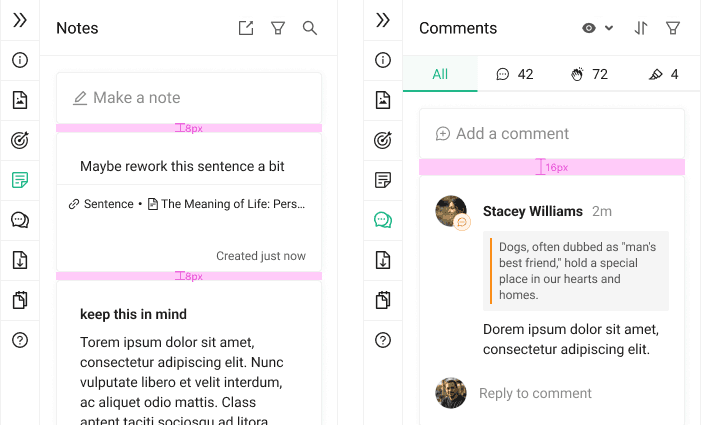
Inconsistent padding in the navigation bar

THE SOLUTION
THE SOLUTION
Documentation as a product
Documentation of the design system needed to be treated like a living product: clear, visual, easy-to-use, and iterative.
Documentation as a product
Documentation of the design system needed to be treated like a living product: clear, visual, easy-to-use, and iterative.
Documentation as a product
Documentation of the design system needed to be treated like a living product: clear, visual, easy-to-use, and iterative.
Documentation as a product
Documentation of the design system needed to be treated like a living product: clear, visual, easy-to-use, and iterative.
Documentation as a product
Documentation of the design system needed to be treated like a living product: clear, visual, easy-to-use, and iterative.
Documentation as a product
Documentation of the design system needed to be treated like a living product: clear, visual, easy-to-use, and iterative.
Consistency with flexibility
Components and patterns needed to be standardized to create a cohesive experience. However, there needed to be room for flexibility so that the system can be adapted to new contexts easily.
Consistency with flexibility
Components and patterns needed to be standardized to create a cohesive experience. However, there needed to be room for flexibility so that the system can be adapted to new contexts easily.
Consistency with flexibility
Components and patterns needed to be standardized to create a cohesive experience. However, there needed to be room for flexibility so that the system can be adapted to new contexts easily.
Consistency with flexibility
Components and patterns needed to be standardized to create a cohesive experience. However, there needed to be room for flexibility so that the system can be adapted to new contexts easily.
Consistency with flexibility
Components and patterns needed to be standardized to create a cohesive experience. However, there needed to be room for flexibility so that the system can be adapted to new contexts easily.
Consistency with flexibility
Components and patterns needed to be standardized to create a cohesive experience. However, there needed to be room for flexibility so that the system can be adapted to new contexts easily.
Developer first implementation
To ensure efficient hand-off, documentation and naming conventions needed to be clear and concise.
Developer first implementation
To ensure efficient hand-off, documentation and naming conventions needed to be clear and concise.
Developer first implementation
To ensure efficient hand-off, documentation and naming conventions needed to be clear and concise.
Developer first implementation
To ensure efficient hand-off, documentation and naming conventions needed to be clear and concise.
Developer first implementation
To ensure efficient hand-off, documentation and naming conventions needed to be clear and concise.
Developer first implementation
To ensure efficient hand-off, documentation and naming conventions needed to be clear and concise.
THE PROCESS
THE PROCESS
Research insights
Research insights
Design & Dev
User experience of the application lacked consistency across desktop, tablet, and mobile due to frequent ad-hoc change requests and an absence of proper component usage guidelines, governance model and maintenance. Developers faced friction due to unclear specs and inconsistent changes to components throughout the design.
Findings
The current design system was not built with scalability in mind, resulting in inconsistency.
How might we…
How might we create a scalable design system that is reusable and easy for designers and developers to understand?
Phases
Phases
Phase 1: Audit


I conducted an audit to assess the desktop and mobile app to reveal inconsistencies and simplify the number of components used.
Phase 2: Modules

I broke down the components into properly named and tokenized colors, typography, and grid/spacing values in Figma.
Phase 3: A modular library

I created a clear, simple-looking library for future designs. This included clear documentation and updating the components.
Challenges
Challenges
Ongoing projects and designs
Designs and projects were still happening in the midst of this design system overhaul, so newly built components or updates to old components often affected the process.
Ongoing projects and designs
Designs and projects were still happening in the midst of this design system overhaul, so newly built components or updates to old components often affected the process.
Ongoing projects and designs
Designs and projects were still happening in the midst of this design system overhaul, so newly built components or updates to old components often affected the process.
Ongoing projects and designs
Designs and projects were still happening in the midst of this design system overhaul, so newly built components or updates to old components often affected the process.
Ongoing projects and designs
Designs and projects were still happening in the midst of this design system overhaul, so newly built components or updates to old components often affected the process.
Ongoing projects and designs
Designs and projects were still happening in the midst of this design system overhaul, so newly built components or updates to old components often affected the process.
No existing design system template or governance model
Since the design system was never properly built (we were only using Styles before), I needed to create a uniform design system template that reflected UX, content, product, and engineering considerations.
No existing design system template or governance model
Since the design system was never properly built (we were only using Styles before), I needed to create a uniform design system template that reflected UX, content, product, and engineering considerations.
No existing design system template or governance model
Since the design system was never properly built (we were only using Styles before), I needed to create a uniform design system template that reflected UX, content, product, and engineering considerations.
No existing design system template or governance model
Since the design system was never properly built (we were only using Styles before), I needed to create a uniform design system template that reflected UX, content, product, and engineering considerations.
No existing design system template or governance model
Since the design system was never properly built (we were only using Styles before), I needed to create a uniform design system template that reflected UX, content, product, and engineering considerations.
No existing design system template or governance model
Since the design system was never properly built (we were only using Styles before), I needed to create a uniform design system template that reflected UX, content, product, and engineering considerations.
The new design system
The new design system
Before
Before
Before
Before
Before
Before
Styles were used for design purposes only.


After
After
After
After
After
After
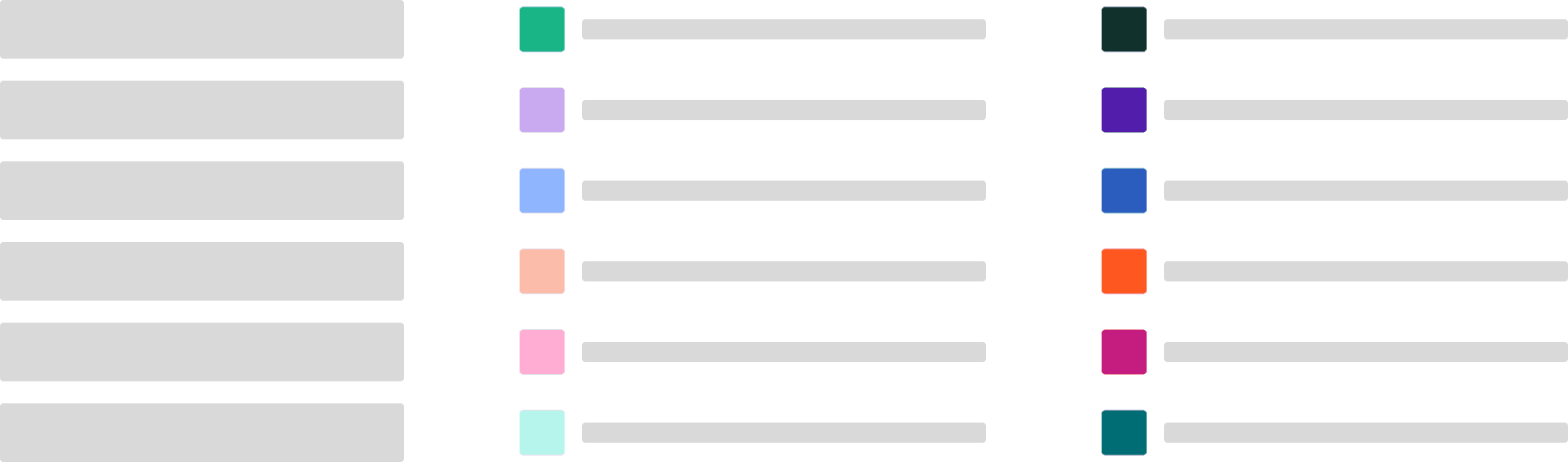
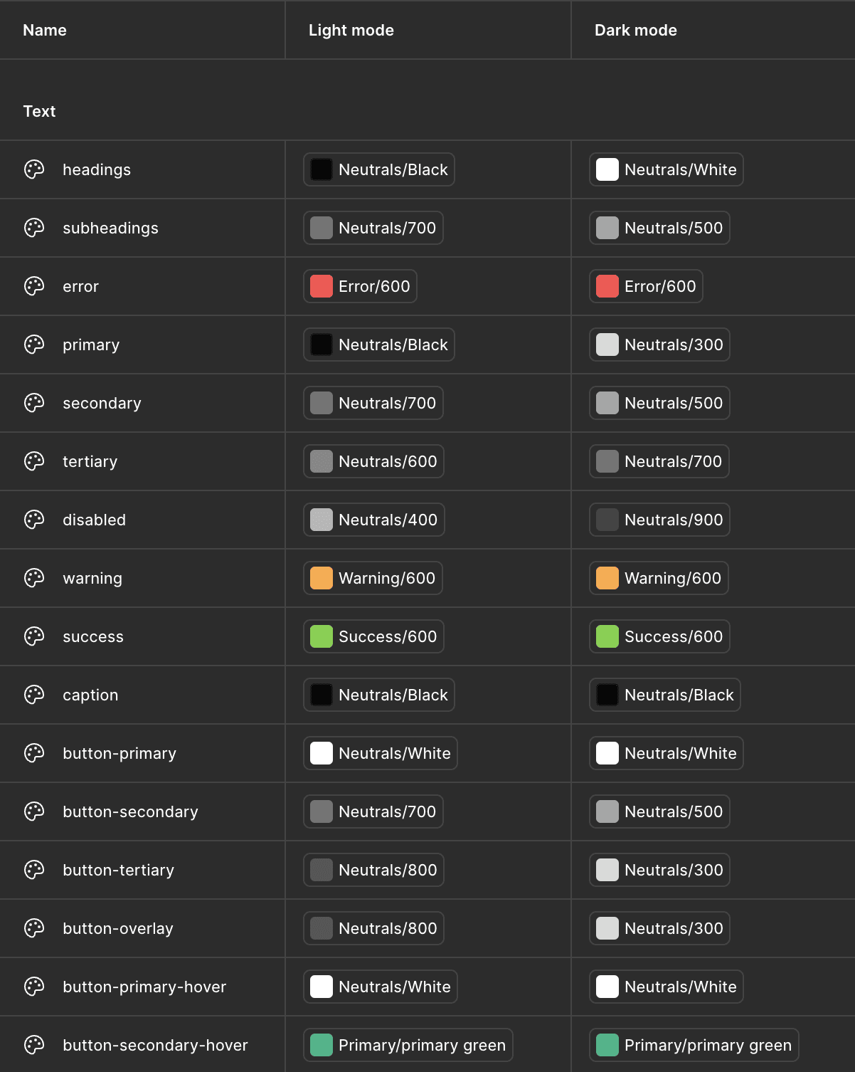
Tokens were created in addition to being named consistently across code and Figma.

Before
Before
Before
Before
Before
Before
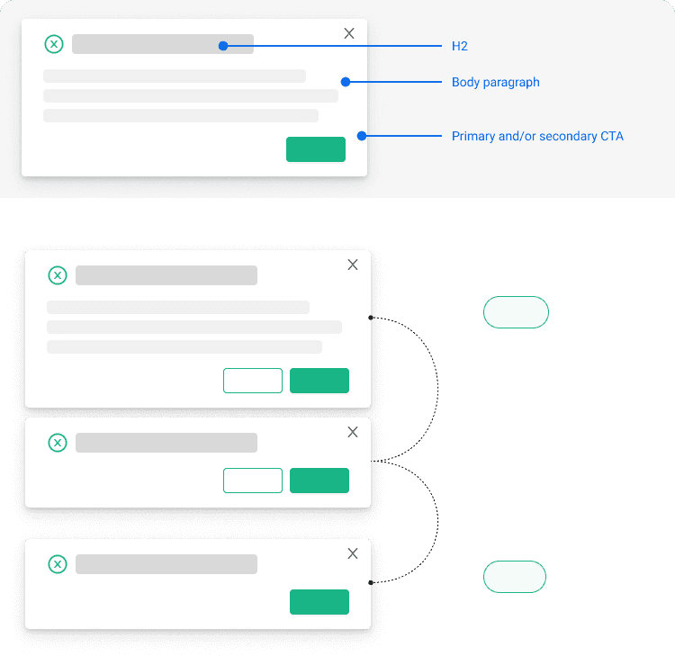
Components are not built with modules, causing inconsistencies as the team scales.

After
After
After
After
After
After
Components are built around toggleable modules to support various content, allowing for multifunctional use and updates.


Before
Before
Before
Before
Before
Before
Component library and documentation of styles were disorganized and scattered across various files.

After
After
After
After
After
After
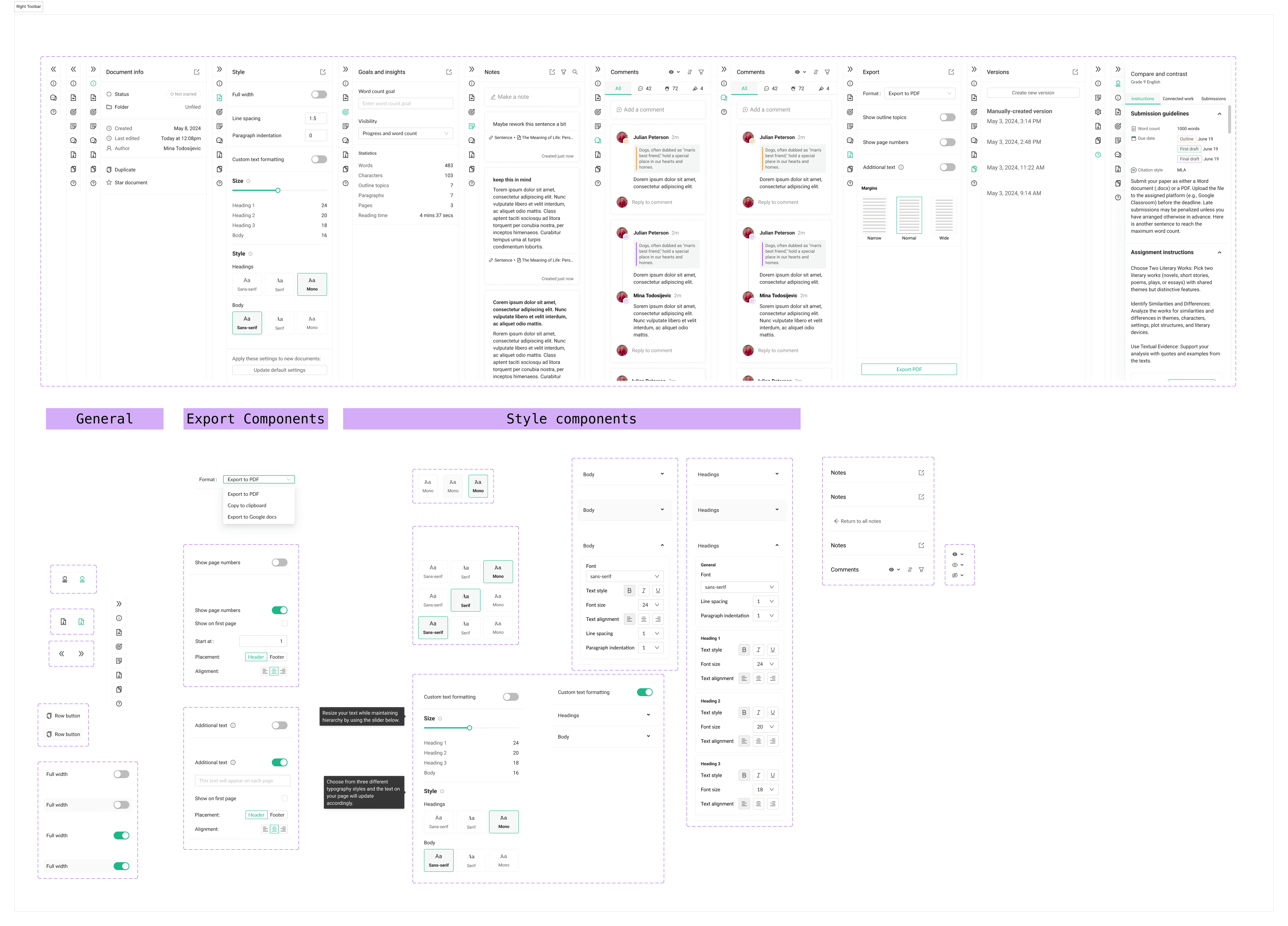
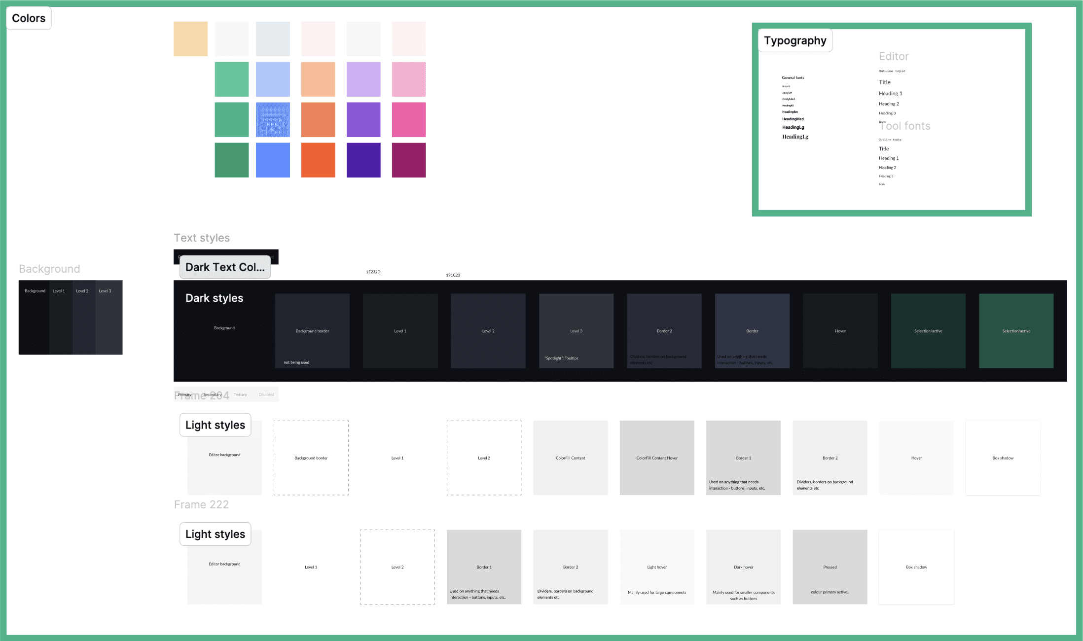
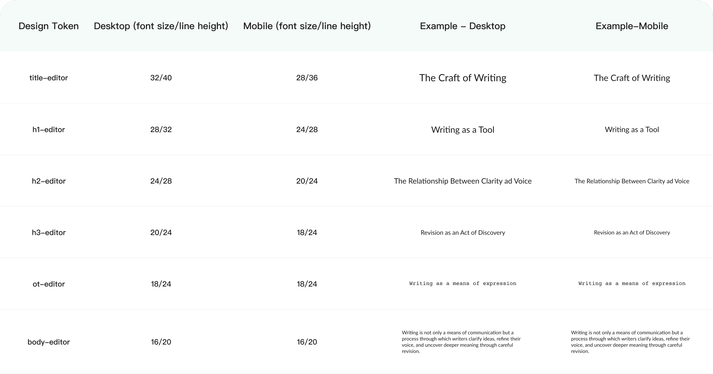
I created a template that consisted of all the tokens organized along with examples and breakpoint views.

outcome
outcome
Since the project is ongoing, I have yet to see the long-term results, however, from a design standpoint, the new system freed up time previously lost to rework, allowing us to create components much faster with a consistency that wasn’t as easily achievable before.
NEXT STEPS
NEXT STEPS
Define a governance model
I would love to define a governance model to ensure that new components are added consistently. This would help with keeping the system reliable and scalable over time.
Define a governance model
I would love to define a governance model to ensure that new components are added consistently. This would help with keeping the system reliable and scalable over time.
Define a governance model
I would love to define a governance model to ensure that new components are added consistently. This would help with keeping the system reliable and scalable over time.
Define a governance model
I would love to define a governance model to ensure that new components are added consistently. This would help with keeping the system reliable and scalable over time.
Define a governance model
I would love to define a governance model to ensure that new components are added consistently. This would help with keeping the system reliable and scalable over time.
Define a governance model
I would love to define a governance model to ensure that new components are added consistently. This would help with keeping the system reliable and scalable over time.
Device/breakpoint tokens
Due to time constraints, creating device tokens for padding was not possible. In the future, I’d like to embed padding tokens specifically for desktop and mobile platforms so that the design workflow is further optimized.
Device/breakpoint tokens
Due to time constraints, creating device tokens for padding was not possible. In the future, I’d like to embed padding tokens specifically for desktop and mobile platforms so that the design workflow is further optimized.
Device/breakpoint tokens
Due to time constraints, creating device tokens for padding was not possible. In the future, I’d like to embed padding tokens specifically for desktop and mobile platforms so that the design workflow is further optimized.
Device/breakpoint tokens
Due to time constraints, creating device tokens for padding was not possible. In the future, I’d like to embed padding tokens specifically for desktop and mobile platforms so that the design workflow is further optimized.
Device/breakpoint tokens
Due to time constraints, creating device tokens for padding was not possible. In the future, I’d like to embed padding tokens specifically for desktop and mobile platforms so that the design workflow is further optimized.
Device/breakpoint tokens
Due to time constraints, creating device tokens for padding was not possible. In the future, I’d like to embed padding tokens specifically for desktop and mobile platforms so that the design workflow is further optimized.

